2023年06月19日
技術夥伴: Navy FAB - Shopify & Ecommerce Experts
方案名稱: Shopify OMO全渠道智能零售方案 (按此了解更多)
客戶名稱: 【ADEXE】
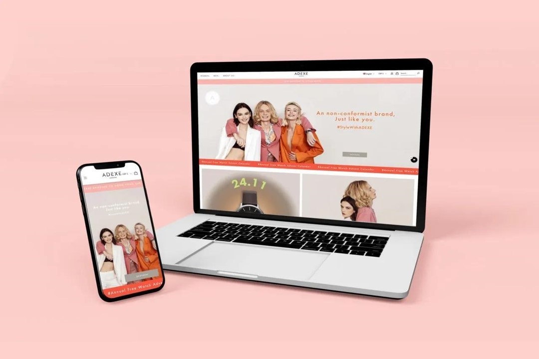
ADEXE 網站全面改版及客製化功能由 Navy FAB 領導。ADEXE 先前曾運轉一個主要面向歐洲客戶的電子商務網站。對於他們的新網站改版項目,他們希望改善客戶購買體驗並客製化他們的網站設計。因為他們的網站將繼續保持在線以便公眾訂購和購買,我們必須創建一個新的主題來進行更新的網站改進要求。由於 ADEXE 的客製化需求很大,Navy FAB 必須開發一個新的主題,以避免在編碼中重疊,這將使清理和實施更改變得困難。因此,Navy FAB為網站進行了完全改版和客製化。
As ADEXE had heavy customization requirements, Navy FAB had to work on a new theme in order to avoid overlapping in coding which will make it hard to clean up and implement the changes. Hence, a complete revamp of the site with customizations was carried out.
Adding more visual effects on the site was one for ADEXE”s goal of the revamp project. Text animation effect was added on the Homepage to create a Visual Attraction. This element was also added to the Menu Headers which helps to guide customers between different menu categories such as “Watches For Her, Shop Collection, Shop Accessories”.
On the mobile version, the menu header text animation for women was in red while blue for men.
Having a wide variety of collections plus gender-specific products, we had to make sure that the menu bar is organized well so it will be easy for customers to navigate. As such, Navy FAB created a mega menu with images for each category to make it easy to distinguish between categories.
As per Adexe’s design requirements for the product page, we customized and created a grid layout showing the product image and description alternatively, side by side.
Adexe wants to add a watch customization option for their customers which can be done from the product page. As a result, Navy FAB provided consultation sessions in recommending the app that allows this function and implemented it on the site. Customers can now customize by engraving a personal message, quote, or design on the watch before adding to the cart.
With a variety of unique watch collections, in order for customers to find the right product for them, filter options were created. Customers can now select which strap material, strap colors, dial color, case diameter, and functionality they prefer and narrow down their choices.
For the filters to be visually appealing, we created a field for Adexe to upload the images from the Shopify backend.
When you land on a contact page, it usually has the least designs and elements. However, if you go to Adexe’s contact us page, you will find it to be very different as it has a split-screen design.
On the About Us page, a pop-up was created for individual grids to give the customers more detailed information.